Nudging consumers towards healthier choices
In 2020, during the pandemic's peak, Uber Eats experienced a surge in demand. By 2024, as dining out resumed, this demand receded, prompting Uber Eats to pivot towards online grocery delivery.
I designed a conceptual feature to make online grocery shopping more attractive and beneficial than in-person shopping.
Behavioural science
Nudge theory
UX Research
Prototyping
A/B testing
timeline
Dec 2023 - Feb 2024
Project
Conceptual
project
Tools
Figma
Google Suite
I reimagined the Uber Eats grocery shopping experience, integrating behavioural science to streamline item searches and support business growth. More importantly, I enhanced consumer discovery for healthier choices, to drive positive consumer behaviour.
The challenge
Innovating online grocery
When compared to the in-person grocery shopping experience, I immediately noticed that the online experience has its drawbacks.
Meat and produce are more subject to personal taste. Ignoring cost, in most cases visual appeal is the one of the dominant factors in selecting items in either category. I see no way to accurately convey that via description or even with a photo. What constitutes overly ripe bananas to one person is likely to be far different for another.”
— Via RetailWire
Has Uber Eats addressed this?
Uber Eats addressed this drawback with a ‘best match’ feature which allows users to guide shoppers more accurately. But is it enough?
The question still stands: How can online grocery shopping offer more unique advantages that are not available through the in-person shopping experience?
starting with the bigger picture
An opportunity for positive impact
While re-imagining the grocery browsing experience for Uber Eats is a worthwhile challenge in itself, I felt it was important to acknowledge that the food industry holds some of the biggest levers for behavioural change.
We cannot reasonably expect people to make healthy and sustainable food choices when the food environment is so heavily geared around tasty, convenient, cheap, plentiful, and culturally normative produce.”
— The Behavioural Insights Team
I recognized that this was an opportunity to shape the digital ‘choice environment’ (a midstream approach), making healthier and more sustainable options readily accessible— and aligning with the growing consumer demand for these options.

Adapted from How to build a Net Zero society, 2023
my goals
Re-framing the question
This led to me reframing the research question:
Original question
How can online grocery shopping offer more unique advantages that are not available through the in-person shopping experience?
New question
How can we leverage the online grocery shopping experience, to create both a positive business and human impact?
Understanding consumer habits
According to ‘A Menu for Change’, customers prioritize taste, cost, variety, and convenience, with health and sustainability coming last.
This is due to the value-action gap, which suggests that despite having good intentions, psychological and practical barriers prevent consumers from making healthier or more sustainable choices. Understanding these barriers is key to influencing behaviour change.
USER INTERVIEWS
The hourglass method
I carried out interviews with 6 participants, using the hourglass method when asking questions to help me uncover the users’ habits.
Start broad: What does grocery shopping planning look like for you?
Zoom in: Pretend you are at the grocery store. Can you walk me through the process of how you decide between items?
Zoom back out: What made you start or stop using the grocery delivery app?
KEY INSIGHTS
A quick gut decision
When talking to one participant about how they choose which grocery store to shop at, this answer particularly stood out to me:
I've recently become obsessed with this elderflower drink, but my grocery store doesn’t carry it. The next closest store isn't great for fresh produce, so it didn't make sense to walk there. Instead, I searched online for stores that carry the drink, and found that Sainsbury’s, a high-quality supermarket, had it. I decided to order all my groceries from Sainsbury’s through Uber Eats, since it was too far to walk to, but I’m happy now I know where to get the drink and get my groceries done!”
This participant was weighing out many different needs all at once which includes: personal preferences, distance & quality of fresh produce. This quote captures the essence of the decision-making process, highlighting the complexity of how shoppers’ minds work when faced with many alternatives.
Often participants employed short-cuts to allow them to make quick decisions without knowing all the alternatives, to reduce information overload. They allow one key cue to dictate their decisions, in this case the need for the elderflower drink!
problem statement
Is take-the-best heuristic ideal?
Consider this quick story:


In short, we often employ take-the-best heuristic sub-consciously when we need shortcuts so that we aren’t overwhelmed with choice overload. In some cases, this type of behaviour is time-saving and beneficial, but in other cases, the lack of information may prevent users from making the optimal decision.
Data shows that health preferences do matter for people - but to what extent are we making the most optimal choices with so much information?
Instead it is important to ask:
What shortcuts could have been provided to better help Amy make an optimal choice, based on her health & personal preferences?
In other words, how might we empower grocery shoppers with a greater sense of personal agency, knowledge, and confidence in their choices when ordering groceries online?
Ideation
Learning from the in-person grocery shopping
To answer this question, I compared online and in-person grocery shopping experiences, making direct observations at my local store alongside my interviews. I identified two distinct needs:
The need for clear information
At my local supermarket, I observed that items were labeled according to health and dietary preferences, such as organic, gluten-free, and keto. This underscored the importance of clear and accessible information in helping consumers make informed decisions quickly and effectively.


The need for a visually-engaging experience
A second observation from the interviews highlighted the need for an enjoyable, immersive experience. Grocery shopping can often feel mundane, but participants expressed a desire for curiosity and enjoyment, which was closely tied to the in-person experience of exploring grocery stores:
Maybe I just like the feeling of going to a market. Sometimes I will look at other items on the shelves and if they interest me I will get those as well.”
The enjoyment and effectiveness of in-person grocery shopping are largely driven by visual agency and the ability to explore and discover new items through eye-catching visual cues.
the solution
The formula
Participants would benefit from an engaging and visually-driven shopping experience, which allows them to quickly and easily access to nutritional information and comprehensive details about the product, to align with their personal & health preferences.
From these user needs identified, I now had a formula to help people make optimal choices:
Clear health & dietary information
visually-driven & engaging experience
Optimal and informed choices
It’s not about making technology more human-like. It’s about designing technology to embrace the things that make us human"
— Microsoft Inclusive Design for Cognition Guidebook, 2023
THE PRODUCT
Introducing ‘Your Aisle’
Experience the ultimate personalized grocery shopping, all from the comfort of your own home.

The Pitch
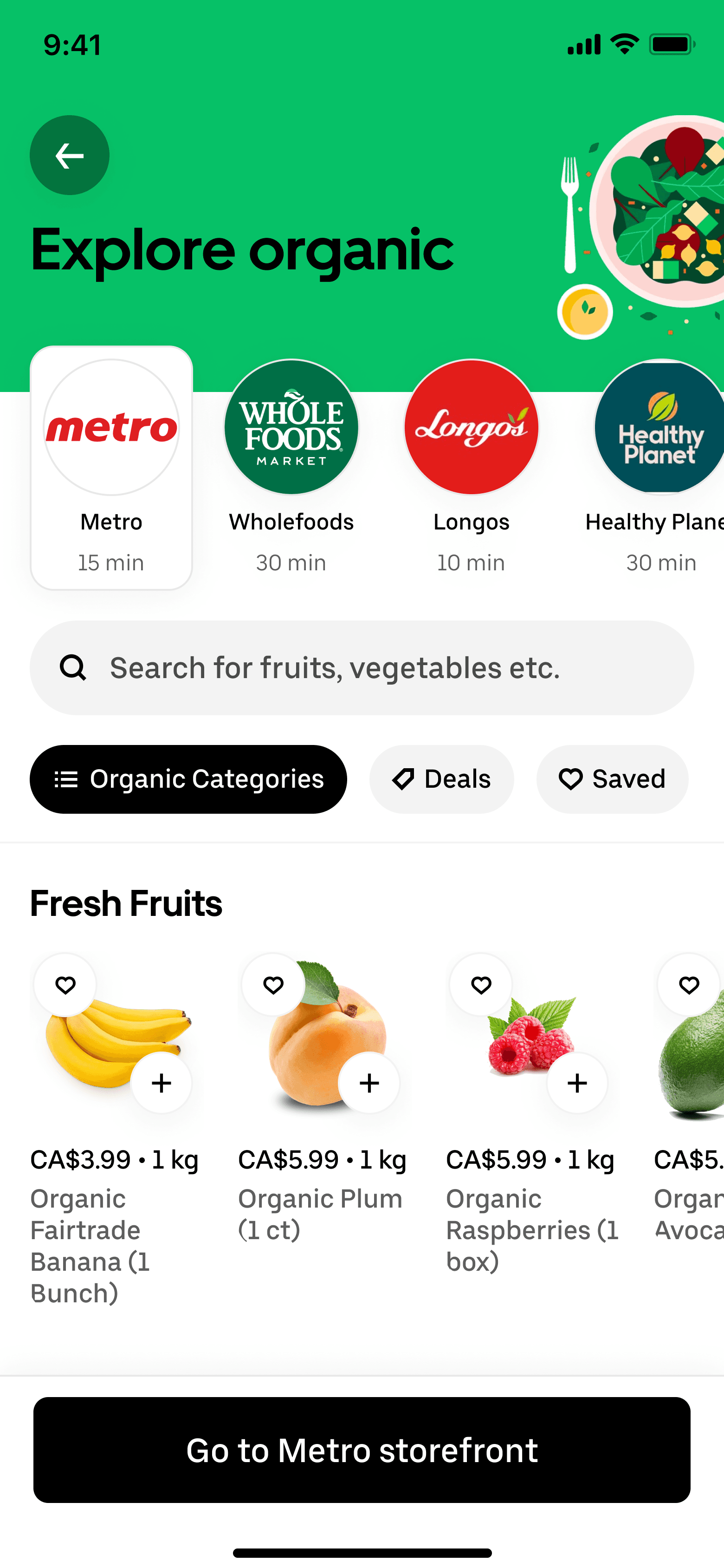
Your Aisle is a new carousel feature that categorizes products according to health or personal dietary preferences, making it easier for you to explore and find products with the tap of a finger.
ABOUT THE FEATURE
Incorporating nudges
I made sure to incorporate the following nudge strategies from the Make it Toolkit to craft a feature that encourages users to make informed choices:

Make it empowering
The carousel provides experiences without predetermined outcomes, allowing users freedom to explore, interact, and shape their own shopping journey. Users are able to edit their health and personal preferences at any point.

Make it intriguing & attractive
Curiosity is sparked by presenting users with a set of colourful cards that they can click on the explore further, mimicking eye-catching visual cues that people enjoy while shopping in person.

Make it obvious
Users are able to view the carousel on multiple pages, including on the main grocery store page as well as individual storefronts. They are able to compare items between different stores easily and effectively.
how we got there
Understanding navigation patterns
To ensures that users encounter the feature when it's most relevant, I identified key entry points on Uber Eat’s pages to strategically place the feature. I mapped this onto the user flow and also considered how the feature could be presented in various forms (for example, as a carousel, filter, or tags).

Through this, I noticed that there were 3 points of entry and methods of navigation that users could use when searching for a specific item:
The search bar
The grocery home page
Specific storefronts e.g. Metro, Walmart
I used these entry points to design how the feature would look for different screens:
mid-fi USER tests
Testing the feature placement & clarity
I decided to conduct user testing at the mid-fi stage in order to determine if users are able to successfully find and understand the new feature when searching for items.
Early findings
Users were more likely to navigate to the grocery storefront of their choice first, before finding the new feature. When seeing the new feature on the grocery homepage, they were more likely to be confused by what it is.

Make it easy
A quick onboarding flow was added to explain the new feature to first time users. The onboarding flow can easily be accessed at any point through the ‘information’ symbol at the top of the carousel.
A/B Testing
Alleviating visual overload
Through the first round of tests, I noticed that that visual overload, specifically on the main grocery page was generally an issue for people when navigating Uber Eats. Given that my goal was to create a visually engaging way to shop online, I designed two versions of the carousel based on feedback I had received, to reduce visual overload.
This allowed me to compare user interactions with each version and assess which one provides a more intuitive experience.
Version A


Version B


Although users prioritized straightforward and clear designs (version 2) they also acknowledged and appreciated instances of visual appeal and interest, which I adapted for my final designs.
concluding thoughts
What I learnt
Understanding the user
Getting to the root of the problem means carefully balancing both behavioural science theory with hands-on user research and testing. Throughout this project, I had to trust the process and put grocery shoppers first, rather than jumping into designing solutions.
If I had more time
While conducting users tests, one participant mentioned wanting to find and save healthy baby products. I would have like to further empower these types of users to take control of their grocery shopping journey. A future addition to the feature could involve allowing users to save items and create their own dietary categories.
Harnessing the power of behavioural science
Perhaps the most acceptable policy or intervention is one that helps consumers make choices that are better on their own terms. This is what a good nudge often seeks to do.”
— A Menu for Change, 2020
Although design thinking aims to address user pain points, focusing on the systems at play (in this case the food system) and the effects of these systems on our societies can be very important for understanding what users may benefit from. Consumers want to change, and want to make healthier choices, but are often limited because of the options they have been given by the food industry. We need a combination of both behavioural science theory and design thinking to tackle these complex problems.
Thanks for reading.
© Sharmeena Lalloo. 2024