Using a human-centered lens to redesign a complex multi-step flight upgrade workflow for a start-up.
B2B2C
E-commerce white label
0-1 Design

The company
This case study summarizes my work with a A B2B start up that provides an ancillary (aka flight upgrade) solution for the airline industry.
They recently introduced a new ‘flight upgrade bidding platform', allowing passengers to purchase or place bids on flight upgrades, once a flight is booked.
The original ask
"Make it look better"
They asked for UI refresh of this bidding platform in time for their demo to secure an important airline partner.
This is where I came in as the sole designer on a team of engineers.
The deeper human challenge.
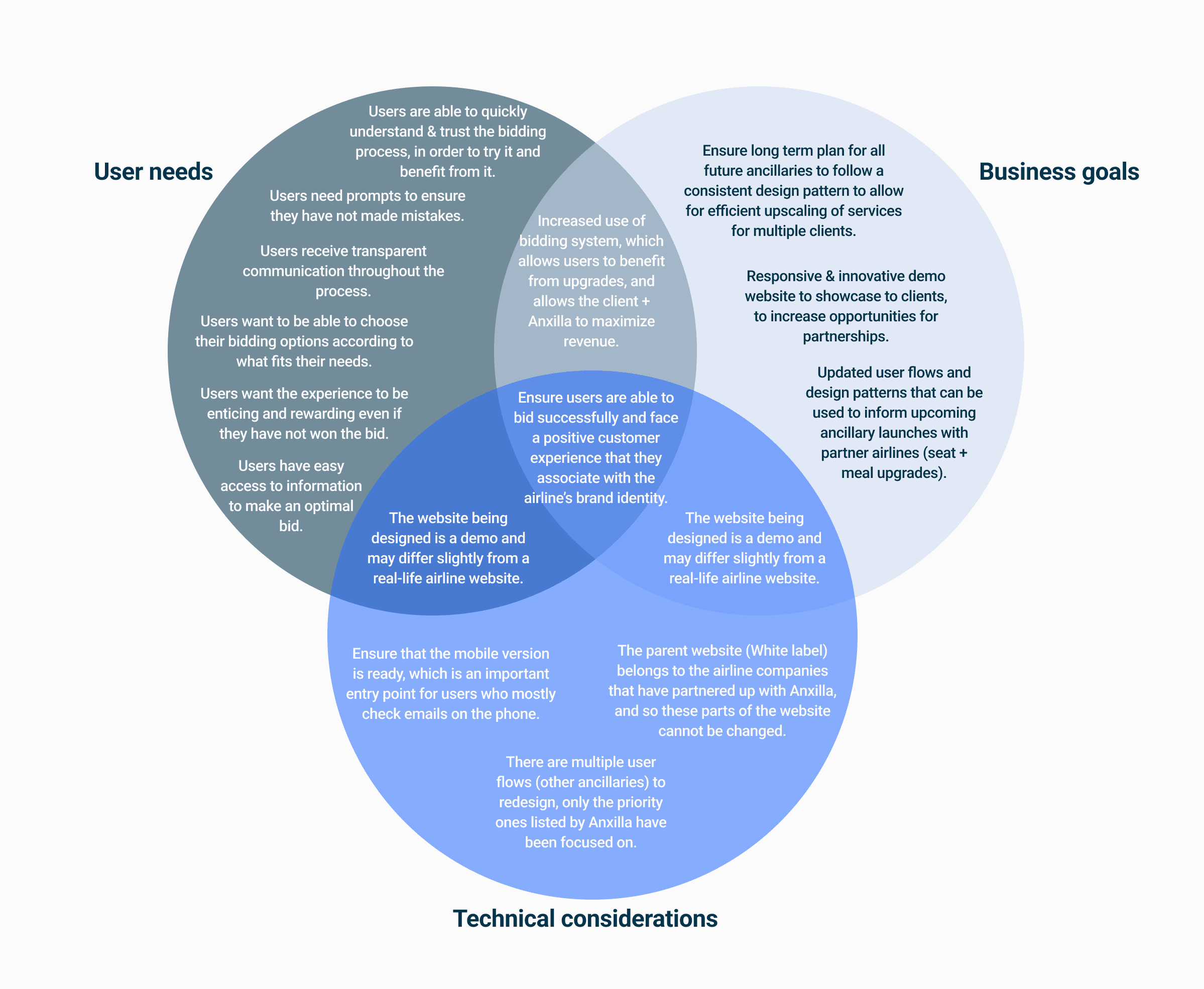
I employed human-centered design thinking methods, which included a benchmark usability test, heuristic evaluation and user interviews. Through this, I uncovered an important piece of the puzzle:
Passengers didn’t trust the bidding process, and this was compounded by their lack of trust in the airline industry as a whole.
“I’m scared of losing my money. Our flight also got canceled once and it was a difficult situation to sort out. So I would rather not attempt anything new."


The business challenge.
Taking a human-centric lens meant creating a better experience not just for end customers, but also for developers and the team— who rely on this system to deliver upgrades.
Without a consistent design pattern, engineers had to build each type of upgrade from scratch, leading to longer timelines and added complexity for their airline partners.
This challenge directly impacted Anxilla’s goal of scaling quickly.
My strategy.
…and how it evolved
I always adapt my approach to the problem that’s presented. I conducted a stakeholder alignment interviews to understand what the client wanted, and then formulated a plan to dig deeper into what they need.
From a UI appoach…
My initial role was to give the platform a UI refresh, ahead of the demo.
…To a user-centered approach…
A UI refresh doesn’t necessarily make a product more user-centric or trustworthy.
And while the platform is a cutting-edge solution for the airline industry, the success of the service relies greatly on one thing: Customer trust & satisfaction.
I needed a design that would make sure were aware of what to expect when bidding, and ultimately avoided risks and felt safe.

…To a human-centered solution
Taking a human-centric lens meant creating a better experience not just for end customers, but also for developers, who rely on this system to deliver upgrades.
To solve for this, I focused on creating a scalable, reusable modular design pattern that could adapt to all upgrade types—streamlining development and aligning with growth ambitions, all while working on their most complex workflow: the neighbour-free seat upgrade.
The outcome
A design pattern that delivers: For passengers & for business.

The solution
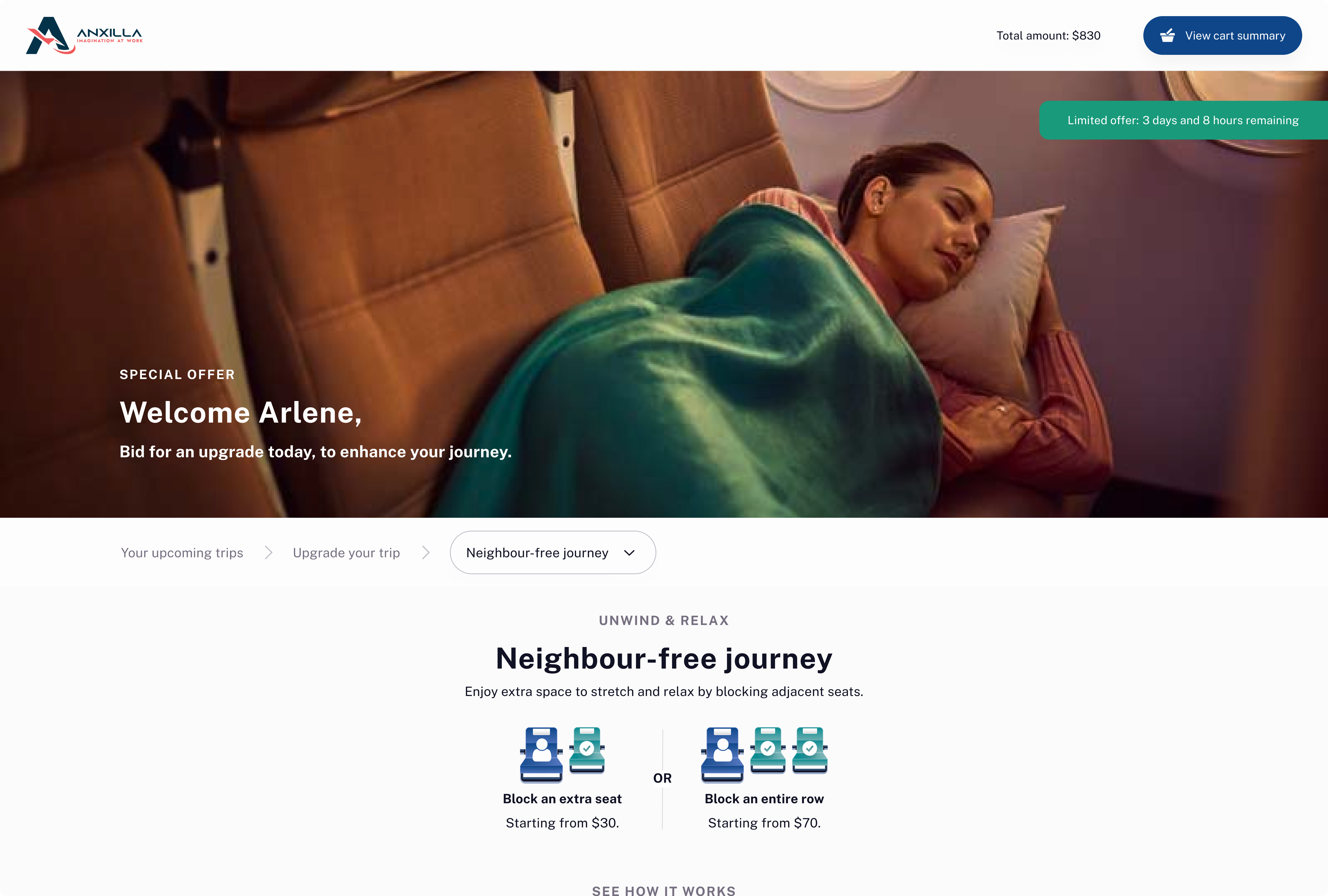
For passengers.
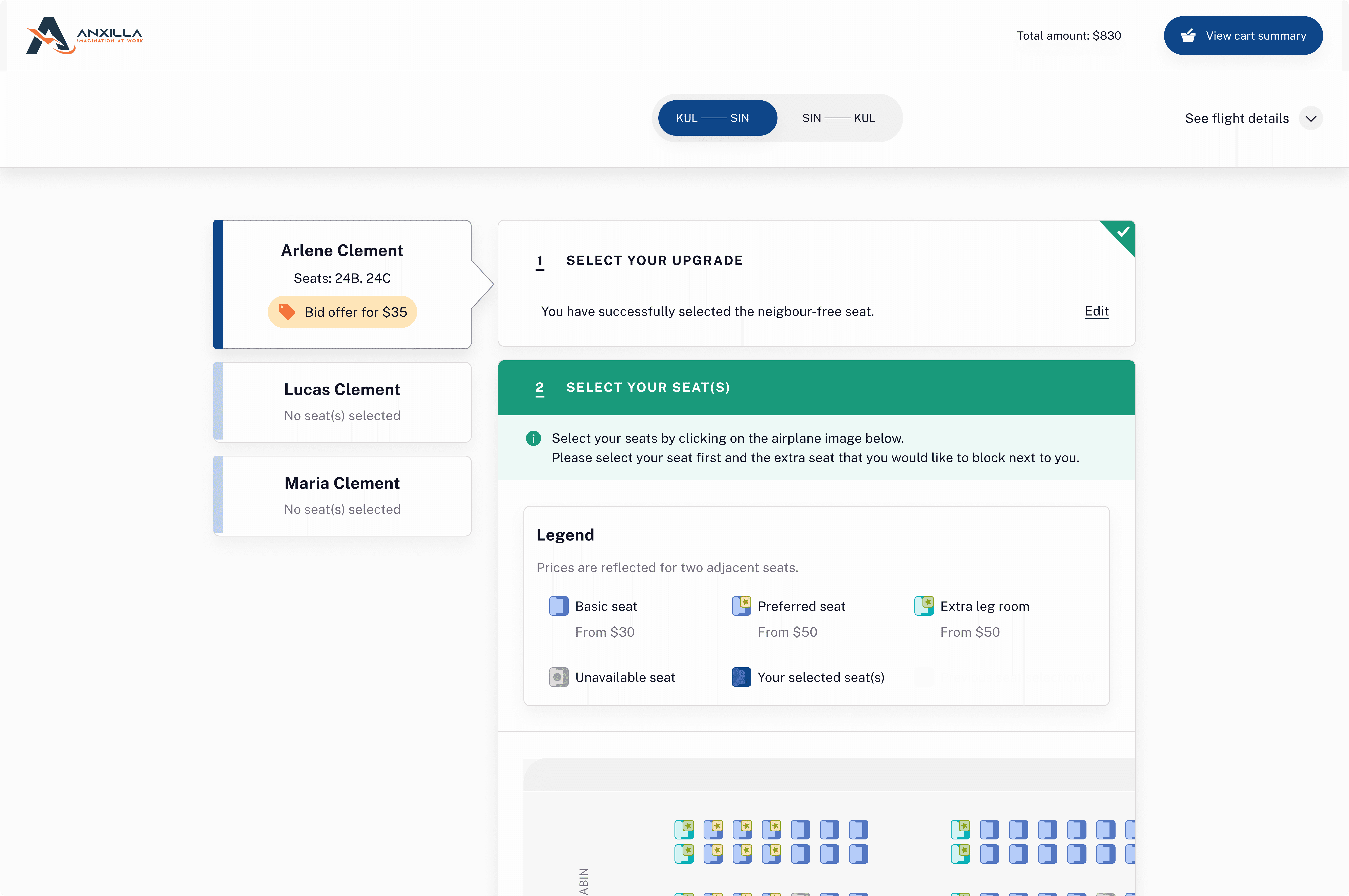
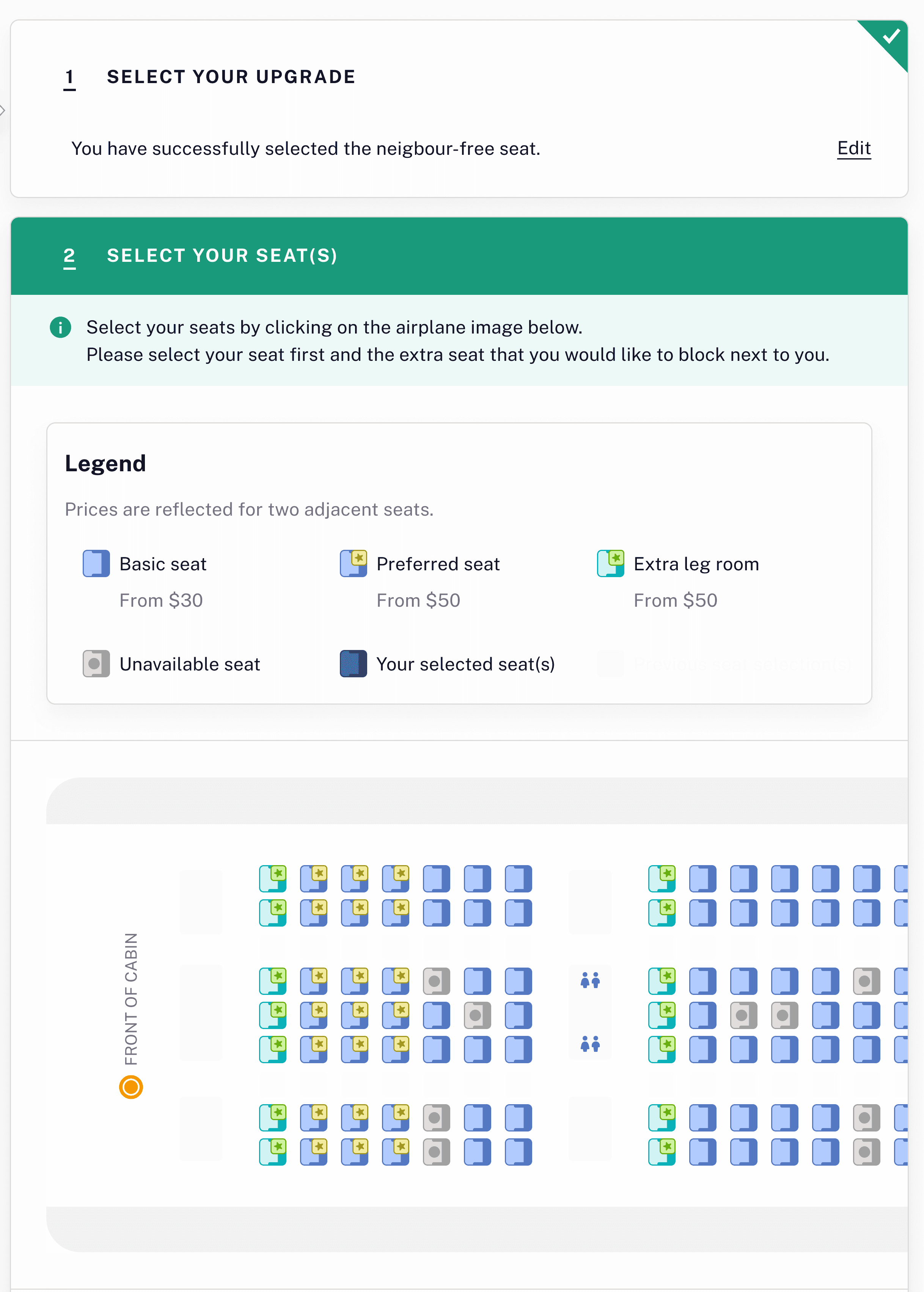
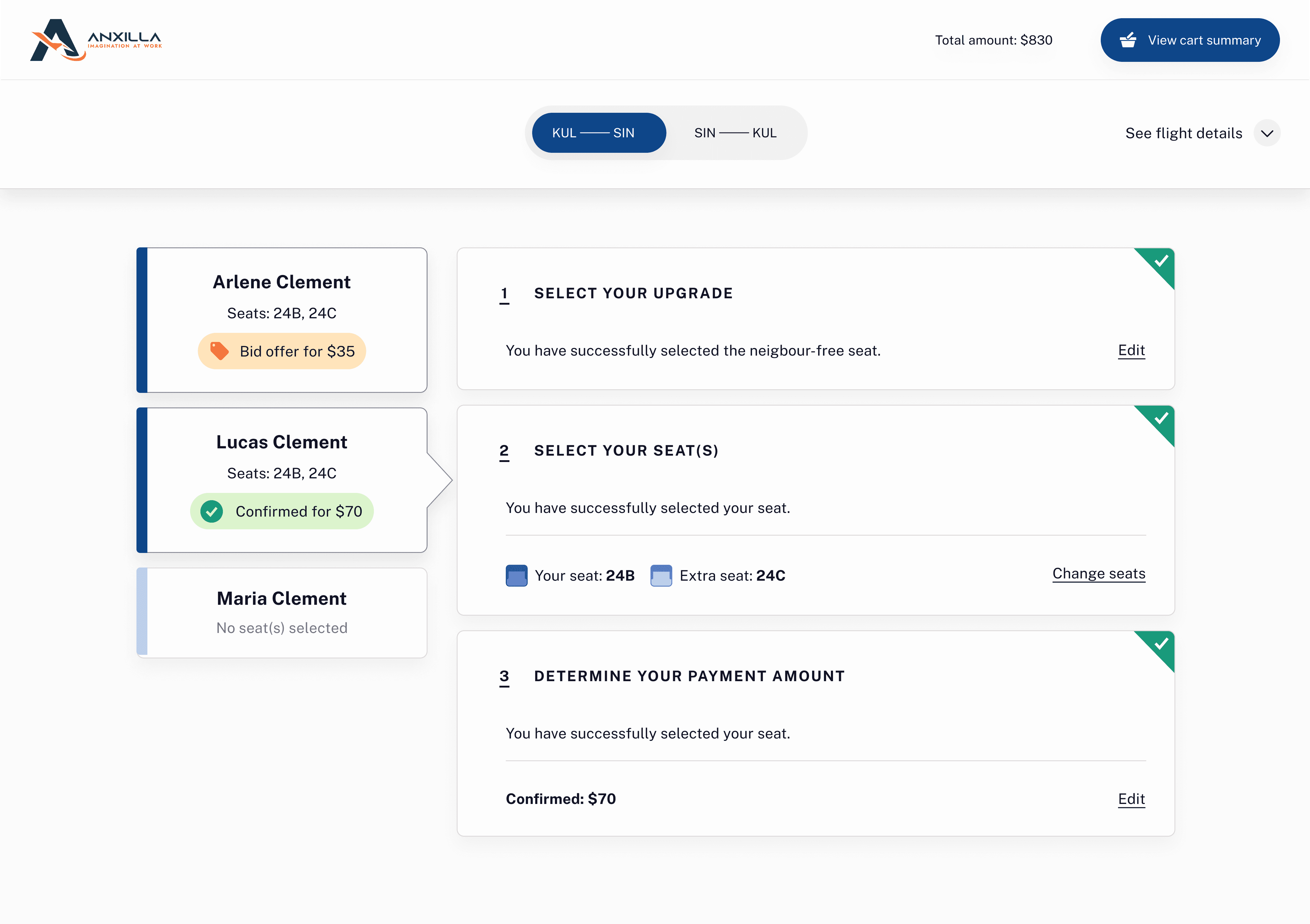
Using wayfinding techniques & progressive disclosure to guide user through the logical process, with steps arranged vertically. Passengers only move to the next step, once the previous step is complete.
For business.
A modular upgrade flow where each step functions as an independent, reusable unit. This improves scalability and maintainability: steps can be added or removed depending on the upgrade type and update specific steps without disrupting the entire system.
For passengers.
Passenger selections were displayed under name cards and updated at every step. This allowed users to easily track selections across multiple passengers — avoiding wrong selections and cognitive overload.

For passengers.
A pop-up shopping cart to display all selections, for multiple passengers on a ticket, for both outgoing and returning flight.
For business.
This new shopping cart can house multiple upgrade types and caters to the business's plans to provide bundles in the future (i.e. multiple upgrade choices).
For passengers.
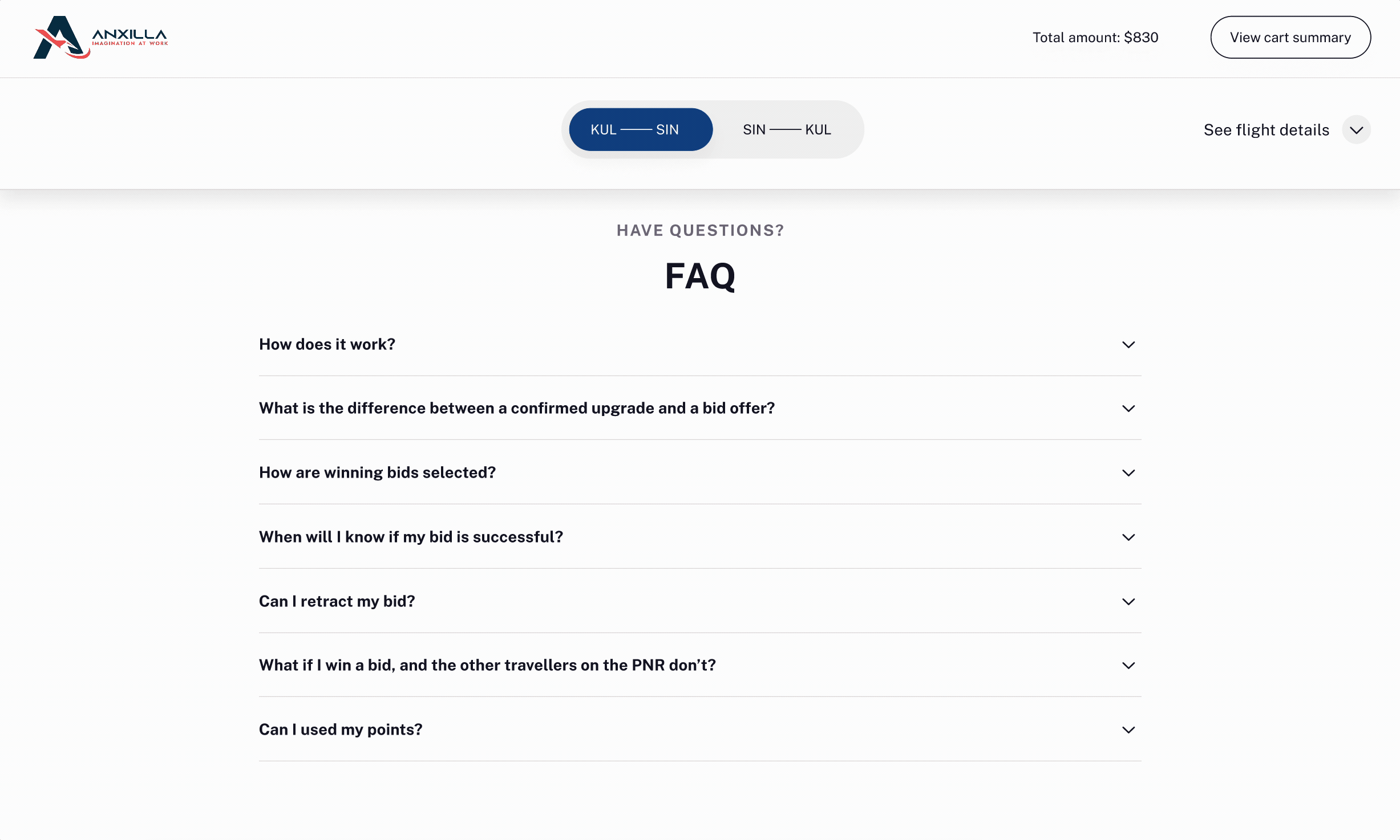
I created an FAQ informed by user interviews and client discussions, ensuring passengers felt informed about what to expect before and after bidding.
For business.
This FAQ section was introduced to provide users with key information upfront, reducing the need to contact customer service—especially since the platform is operated by a third party and does not offer direct airline support.
The result
80%
Task completion rates improved from 20% to 80%.
Established a scalable design pattern that can now be used for multiple ancillaries.
They implemented the redesign with their new airline clients.
My contribution & learnings
By designing for passengers first, I streamlined a disjointed engineering effort into a consistent, component-based system; establishing a scalable & modular design pattern that can now be adapted for all upgrade types. This resulted in a better human experience not just for end customers, but also for the business and engineers.

Introducing iterative design concepts to a startup unfamiliar with these practices wasn’t easy. I advocated for evidence-based decision-making and the value of user feedback, while maintaining a collaborative approach and celebrating small wins along the way. My developer handoff, for example, was quickly embraced. I worked with the team, to understand what they valued and how to incorporate agile concepts. I presented my low-fidelity prototypes at an early stage, and continued to align on direction throughout the process.
As an equity-based designer coming from public policy, this work challenged and strengthened my ability to balance empathy and human-centered advocacy with client goals. I ultimately created a more trustworthy, passenger-friendly experience in a space typically defined by impersonal services and processes.
