Anxilla
Using a human-centered lens to redesign a complex multi-step flight upgrade workflow for a start-up
Product Design
Qualitative research


What is Anxilla?
A B2B company that provides a white label solution for the airline industry. They introduced a new ‘flight upgrade bidding system’ allowing passengers to purchase or place bids on flight upgrades.
The original ask
“Make it look better”
They needed a UI refresh of their bidding platform in time for their demo to secure an important airline partner. This was pretty vague ask.
As a designer, complex challenges excite me. I set out to design for Anxilla’s commercial objectives, while also addressing core user hesitations and concerns.
CHALLENGE
Balancing passenger needs with goals for growth
The human challenge
As I employed human-centered design thinking methods, I uncovered an important piece of the puzzle:
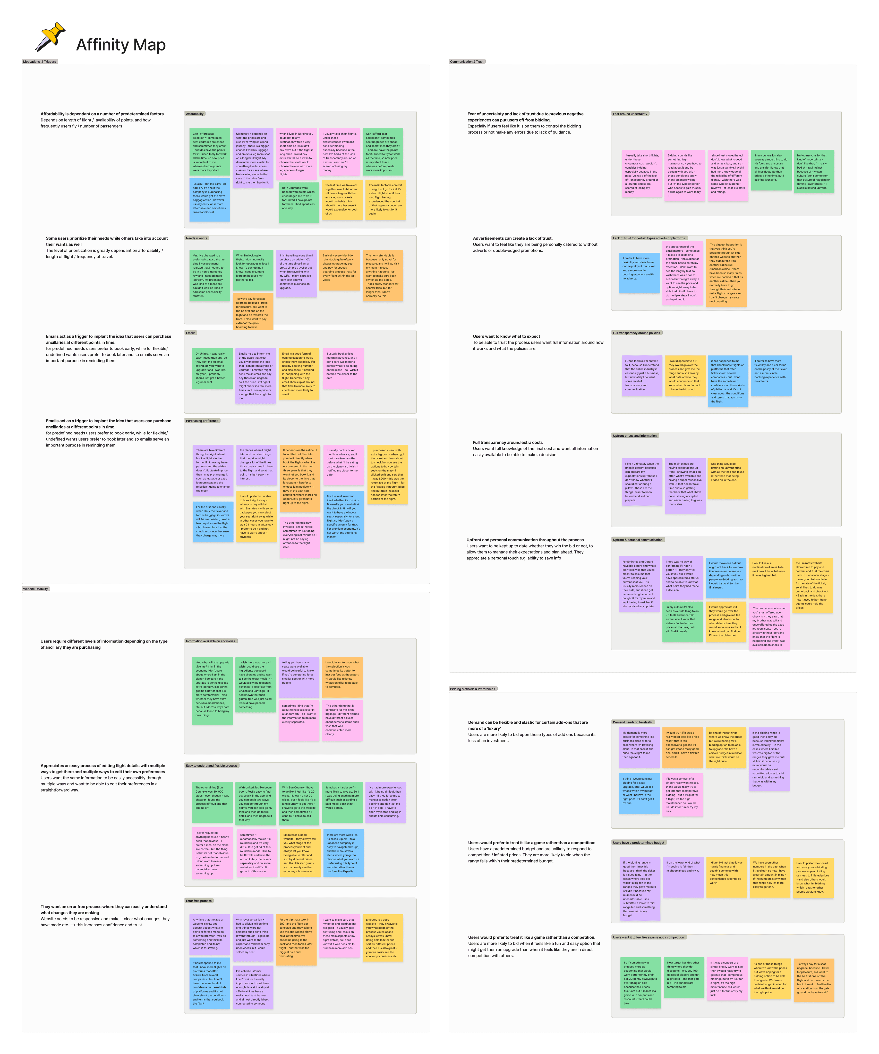
Passengers didn’t trust the bidding process, and this was compounded by their lack of trust in the airline industry as a whole. I was met with a recurring sentiment from users:
“I’m scared of losing my money. Our flight also got canceled once and it was a difficult situation to sort out. So I would rather not attempt anything new."
Solution
A UI refresh doesn’t necessarily make a product more user-centric or more honest. And while the platform is a cutting-edge solution for the airline industry, the success of the service relies greatly on one thing: Customer trust & satisfaction.
I needed a design criteria that would make sure passengers didn’t make mistakes, were aware of what to expect when bidding, and ultimately avoided risks and felt safe. None of this was met by the current design.
The technical & business challenge
Taking a human-centric lens meant creating a better experience not just for end customers, but also for developers, who rely on this system to deliver upgrades.
Without a consistent design pattern, engineers had to build each upgrade from scratch, leading to longer timelines and added complexity. This challenge directly impacted Anxilla’s goal of scaling quickly.
Solution
To solve this, I focused on creating a scalable, reusable modular design pattern that could adapt to all upgrade types—streamlining development and aligning with Anxilla’s growth ambitions.
MY OWN CHALLENGE
Establishing iterative design processes


Most importantly, I had to meet them in the middle.
STRATEGY
Adapting my workflow to lead the end-to-end design process.
I always adapt my approach to the problem that’s presented. I conducted a stakeholder alignment interviews to understand what the client wanted, and then formulated a plan to dig deeper into what they need.
For Anxilla, I incorporated the following methods:
1.
Clarifying core assumptions:
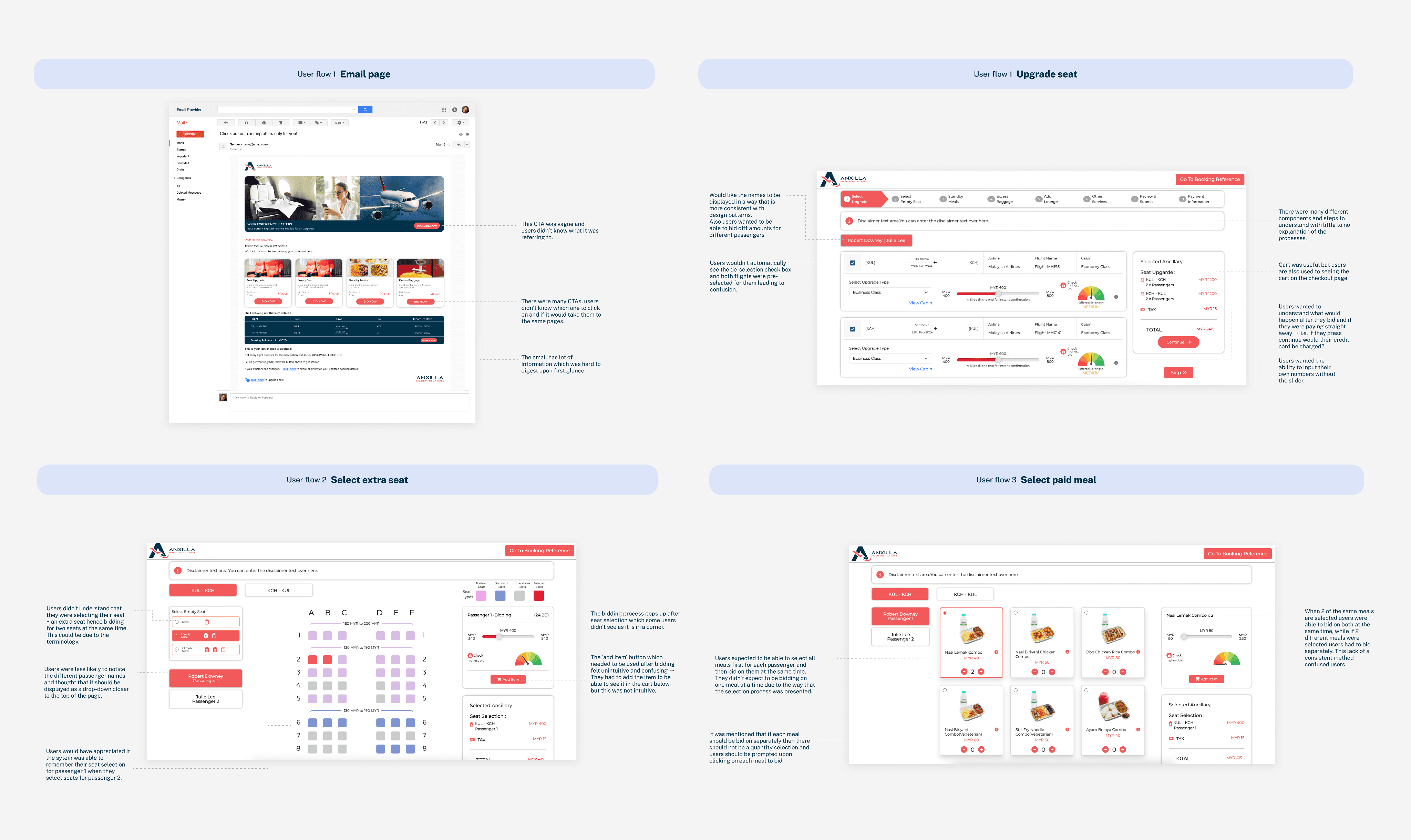
Heuristic audit
I prioritized a heuristic audit first to identify glaring problems. This was quick and confirmed many assumptions.
2.
Setting metrics:
Benchmark tests
I observed how people navigated the existing platform. This helped me identify core pain points and benchmark completion rates.
3.
Diving deeper:
Follow-up interviews
Given the limited time and participants, I asked follow up attitudinal-style questions. This proved vital in digging deeper and understanding how and why passengers felt a lack of trust.
4.
Understanding risks:
Journey mapping
After understanding that passengers were mostly ‘risk-averse’, I mapped the end-to-end user journey for failed bids to identify emotional touchpoints and associated real-life risks.
THE SOLUTION
Making the world more human:
One flight at a time

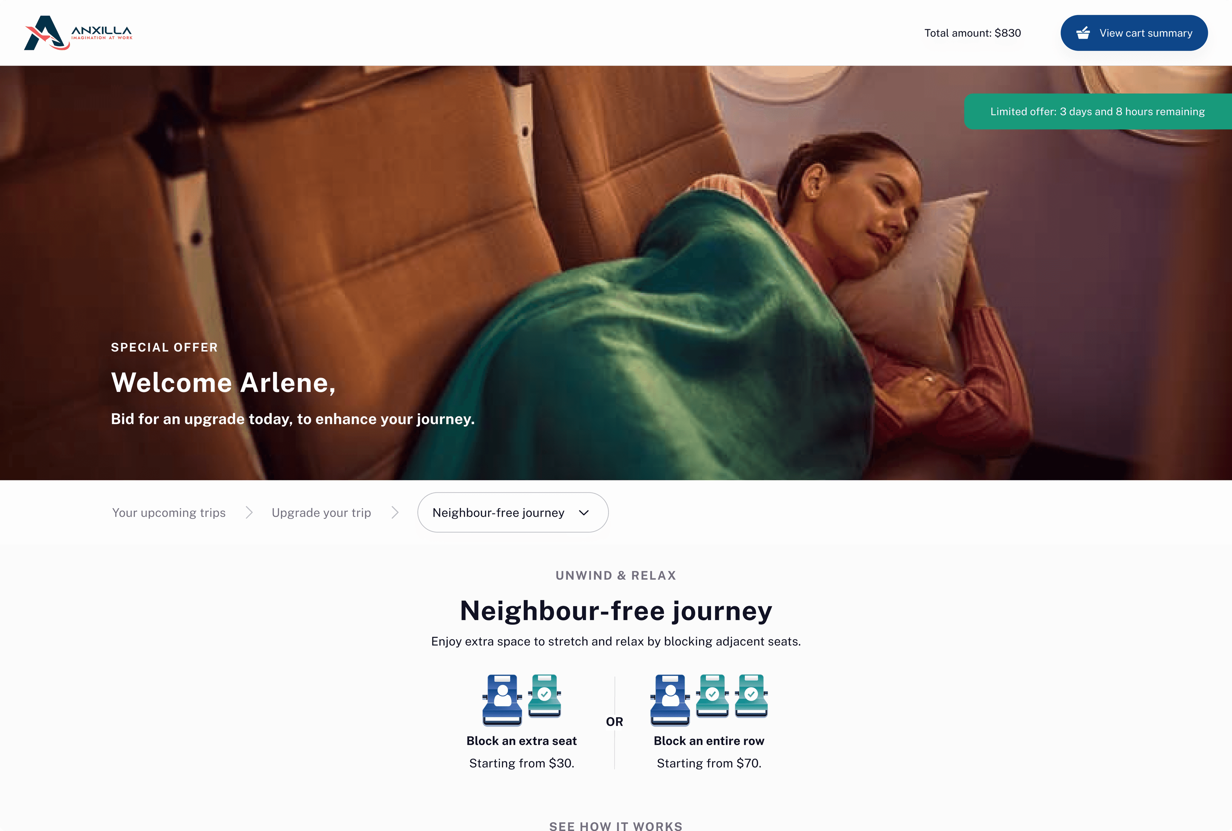
THE FEATURES
A design pattern that delivers: For passengers & for Anxilla

Establishing an intuitive modular flow
For passengers
I reorganized the information architecture of the flight upgrade platform to improve clarity and navigability. Using progressive disclosure and visual anchors, I transformed inconsistent, confusing flows into a logical, step-by-step sequence that matched how users make decisions.
For business
I created a modular upgrade flow where each step functions as an independent, reusable unit. This approach enables Anxilla to easily adapt the workflow for different flight upgrades — whether adding new ancillary products or tailoring flows for various airline partners. This improves scalability and maintainability: teams can introduce new features or update specific steps without disrupting the entire system. Overallm it accelerates time-to-market for new offerings, reduces development overhead, and supports long-term flexibility as Anxilla evolves into a broader flight upgrade marketplace.

Incorporating contextual explanations
For passengers
Drawing on questions from usability tests, I created a step- by-step guide to clarify the bidding process. With Anxilla not offering external support through an email or contact number, I designed an FAQ informed by user interviews and client discussions, ensuring passengers felt supported and informed even without direct customer service.

Aiding visual feedback with with micro-interactions
For passengers
Micro-interactions and visual feedback were key to humanizing the experience and reducing cognitive overload. Each step and passenger card was designed with distinct states to provide immediate clarity once actions were completed
For instance, I displayed passenger selections directly under name cards and added clear visual updates at every step to reinforce trust and system feedback. This allowed users to easily track selections across multiple passengers without having to dig through the cart — making the experience more intuitive and reassuring.

Reducing cognitive overload
For passengers
To reduce cognitive overload, I redesigned the cart as a streamlined pop-up experience. Unlike the original static cart, which overloaded the page with information and lacked flexibility, the new design surfaces key selections in a compact, accessible format. This makes it easier for users to review and manage multiple upgrades without disrupting their flow.
For business
This pop-up cart also supports Anxilla’s future goal of offering bundled upgrades. Unlike the original static cart, it is able to house information for multiple upgrades and so ensures the cart remains scalable as Anxilla expands its offerings.
Introducing a design system
For business
My design system consisted of reusable elements for the workflow, that could be adapted to other types of flight upgrades. This not only streamlined the design process but also ensured a unified look and feel across the dashboard interface and easy integrate with airline partners.
80%
Task completion rates improved from 20% to 80%.
I created a user-centric and scalable design
Anxilla secured the new partner with the redesign.
DESIGN PROCESS OUTCOMES
Bridging engineering and human needs through iterative design
By designing for passengers first, I streamlined a disjointed engineering effort into a consistent, component-based system; establishing a scalable & modular design pattern that can now be adapted for all upgrade types. This resulted in a better human experience not just for end customers, but also for the business and engineers at Anxilla.
Introducing iterative design concepts to a startup unfamiliar with these practices wasn’t easy. I advocated for evidence-based decision-making and the value of user feedback, while maintaining a collaborative mindset and celebrating small wins along the way. My developer handoff, for example, was quickly embraced by the team, while aspects like user testing and uncovering dark patterns were met with more resistance.
As an equity-based designer coming from public policy, this work challenged and strengthened my ability to balance empathy and human-centered advocacy with client goals. I ultimately created a more trustworthy, passenger-friendly experience in a space typically defined by impersonal services and processes.


Get in touch!
Living and working in Tkaronto, an area that has been care taken by the Anishinabek Nation, the Haudenosaunee Confederacy and the Huron-Wendat for thousands of years. I come with respect for this land that I am on today, and for the people who have and do reside here.